Bespoke Data Visualization using R and ggplot2
CHI 2019 Course C21
When and where will it be?
The course will take place at 2pm on Wednesday 8th May 2019. It will be hosted in Room Castle 1 in the Crowne Plaza Hotel.
Materials
You will be given a username and password so that you can access the online materials.
How do I sign up?
You need to register for the course through the CHI 2019 registration system. The cost is USD $25.
Abstract
Being able to visualize data in consistent high-quality ways is a useful skill for HCI researchers and practitioners. In this course, attendees will learn how to produce high quality plots and visualizations using the ggplot2 library for the R statistical computing language. There are no prerequisites and attendees will leave with scripts to get them started as well as foundational knowledge of free open-source tools that they can build on to produce complex, even interactive, visualizations.
Read: CHI Extended Abstract with more details
Who is this course for?
Perhaps you are feeling a bit tired of Excel’s output? Think the SPSS output is a bit spartan? gpplot2 provides a declarative way of creating graphs. This means we can specify how data should be represented, and the library will construct the output based on what we tell it – without fiddling around with pixels to get things looking right. This means that you can:
- Create visualizations you can quickly and easily reused
- Have very fine-grained control over what appears and how it appears
- Recreate your graphs in future and have them look exactly the same.
This sounds like programming…
You’ll be editing code, but it’s not really programming. I’ll provide you with templates and we’ll work through them, making simple changes. The way ggplot2 works means that small but predictable changes can have big effects on the visualisation you create. This means you can very quickly take templates and turn them into something that’s yours.
What do I need to bring?
Nothing, you just have to have a computer with a working browser. You don’t need to install any software, you just need to be able to get into the browser.
Who is teaching this course?

Sandy is an academic at the School of Computer Science and Informatics, Cardiff University. You can email him at goulds@cardiff.ac.uk.
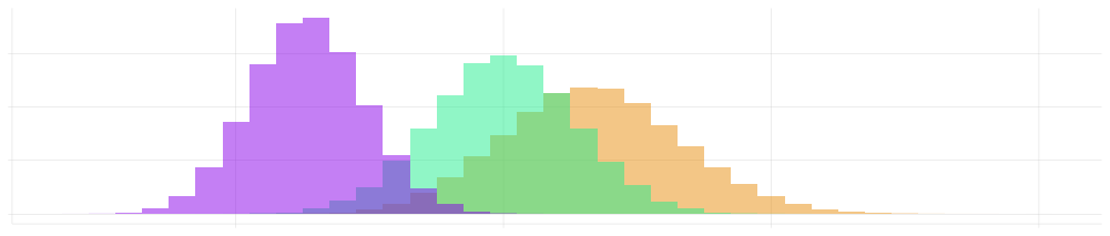
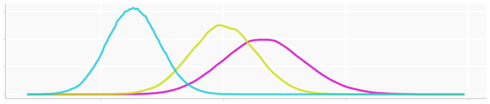
Sandy is an experienced classroom practitioner who has made extensive use of ggplot2 in his publications and as the Analytics Chair for CHI 2018 and 2019.
Sandy has previously run courses on research methods at CHI in 2015, 2016 and 2017. Several of Sandy’s plots made with ggplot2 can be seen in his publications as well as part of the CHI 2018 and 2019 blogs.
You can email Sandy if you have any questions about this course: goulds@cardiff.ac.uk